Back

OOKLOK

A little more play in the everyday. A booking experience for the services that come to you.

My contribution
UI, UX & animation
Project status
Delivered project
With
Tonic
Year
2019

Booking a haircut at home should be simple, and it can still smile: plain structure, playful colour, letters and movement.

  • 8service names set in the brand’s letters
  • 6colours shared across the services

Context.

A haircut at home. A repair that cannot wait. OOKLOK brought everyday services in Dubai into one booking experience, so the help you need could come to you.

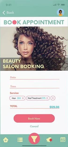
The work brought UI, UX and animation together around a warm, colourful identity. The original booking screens shown here use dollar-denominated prices.
Everyday help, with a little personality.

The wordmark became a small playground. Its round letters turn into dots, a clock or a loading sequence, so the identity keeps moving from the first impression into the product.

A palette across services.

The screens and animations use coral, mint, sky blue, soft yellow, peach and teal across the different services.

Coral

  1. Splash#ef6176W 3.16 AA largeB 6.64 AA

Mint

  1. Thank you#7fbfaeW 2.11 —B 9.97 AAA

Sky blue

  1. Accounts#9cc9e9W 1.76 —B 11.94 AAA

Soft yellow

  1. Introduction#eccc77W 1.56 —B 13.47 AAA

Peach

  1. Wordmark#eed3c4W 1.42 —B 14.75 AAA

Teal

  1. Identity#43615bW 6.78 AAB 3.10 AA large

Colours taken from the project’s own animations and screens. Each swatch is rated for contrast with white (W) and black (B) text.

Familiar ways in.

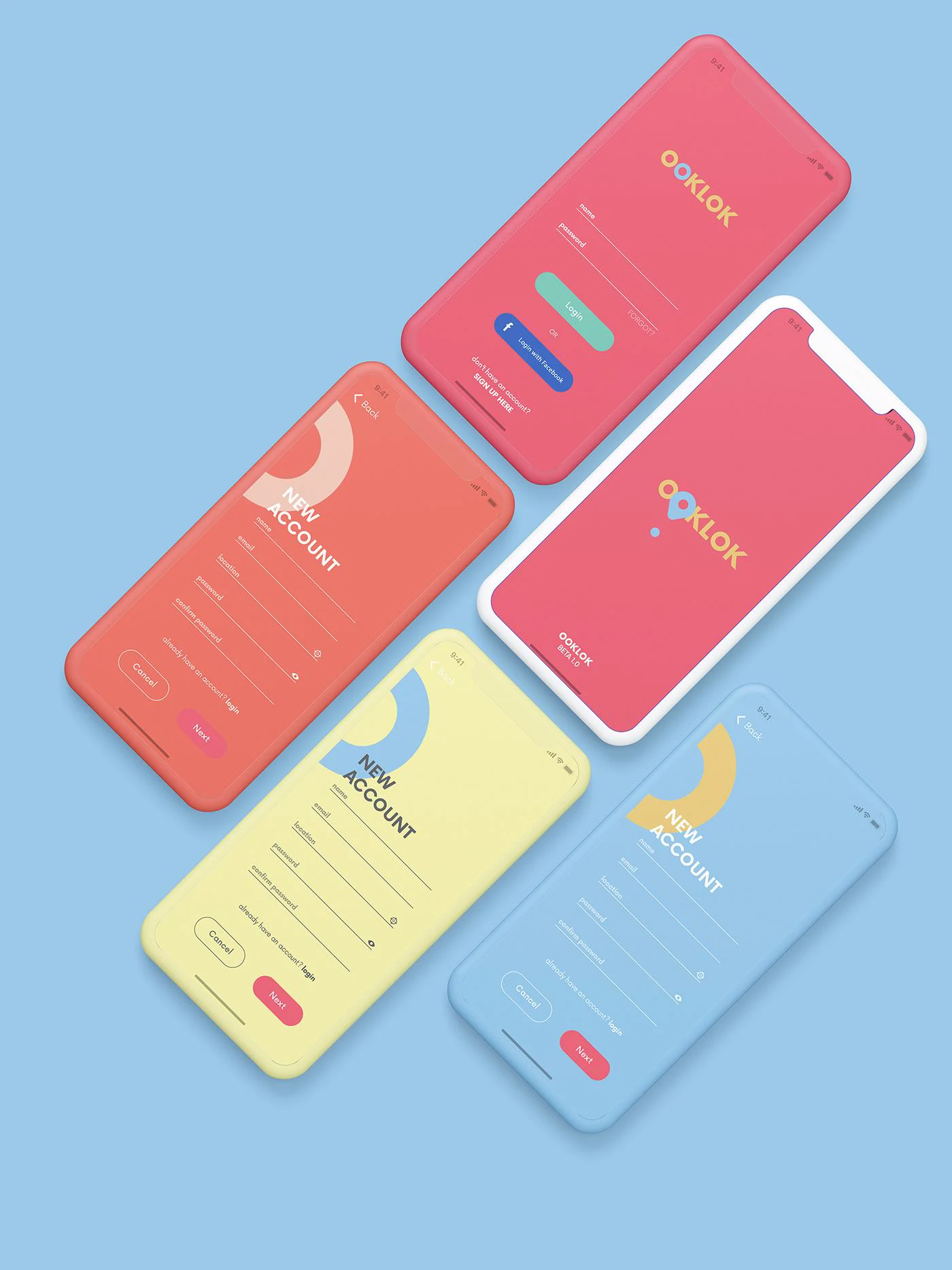
Login and registration use familiar fields and clear actions, in the same palette as everything around them.

  • The splash animation carries the wordmark straight into the app, so the first screen already sounds like the brand.

  • OOKLOK login, registration and splash screens arranged on colourful phone mockups

    Login and new-account screens in coral, yellow and sky blue.

A voice that belongs to the experience.

Everyday services become the subject of playful language, bold type and bright photographic arrangements.

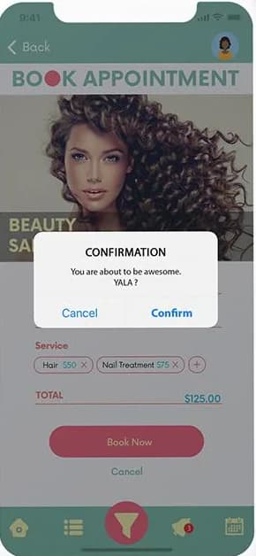
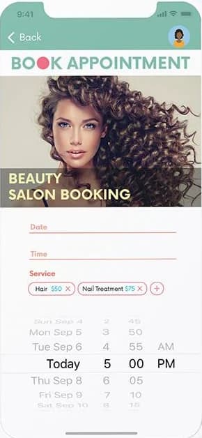
Playful lines sit alongside appointment details and confirmation actions.

  • Service names set in the brand’s own letters.

  • “It’s child’s play, so book yourself a nanny.” A booking, said with a wink.

  • A warmer ending: success closes the loop with a thank you that moves.

The same language, on the web.

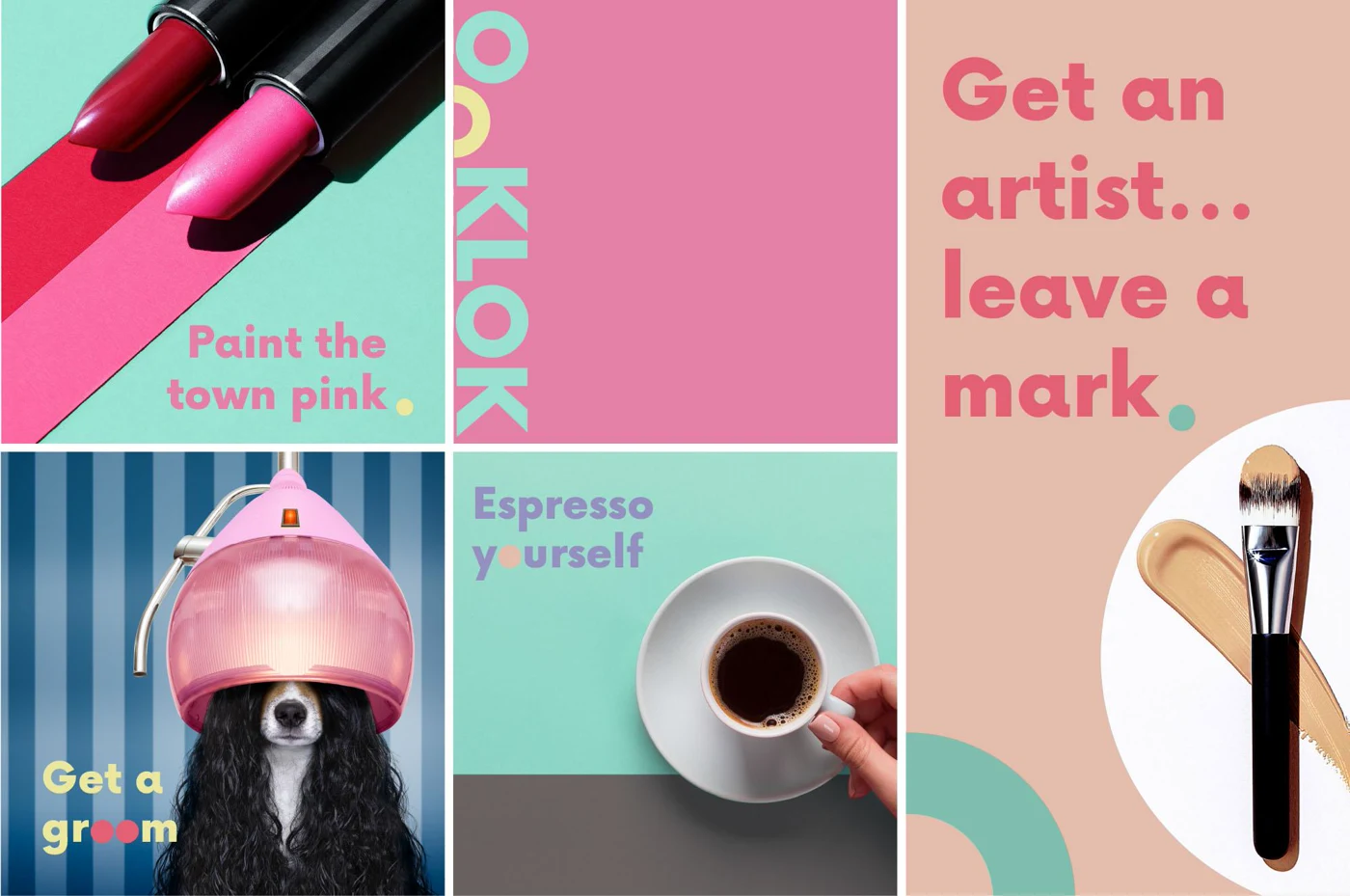
On the website, a beauty feature, campaign tiles and an invitation to get the app carry the same colours and the same voice.

  • The same language on the website, scrolling on a tablet.

  • Colourful OOKLOK service compositions featuring beauty, grooming and coffee imagery with playful copy

    Campaign compositions carry the colour and the voice into service stories.

What I take
from it.

The wordmark moves through splash screens, loading and confirmation, while the appointment keeps the booking details together. The functional moments carry the identity too.

Ahmed Mowgoud — UI, UX & animation

Tonic — agency

Let's
have it.

UI/UX, Product Design, Interaction Design, Art Direction.Let's Play together.