Back to home

NEOM Wildlife

Bringing nature into view. Wildlife and conservation discovery within the NEOM SuperApp.

My contribution
UI, product & UX
With
Publicis Sapient
Year
2025
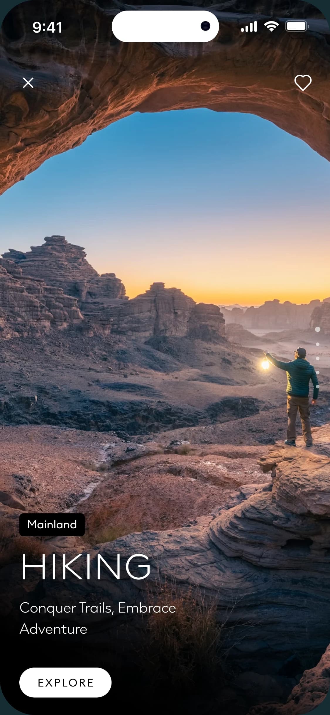
NEOM app screen showing a hiker with a lantern beneath a rock arch at sunrise, tagged Mainland and titled Hiking
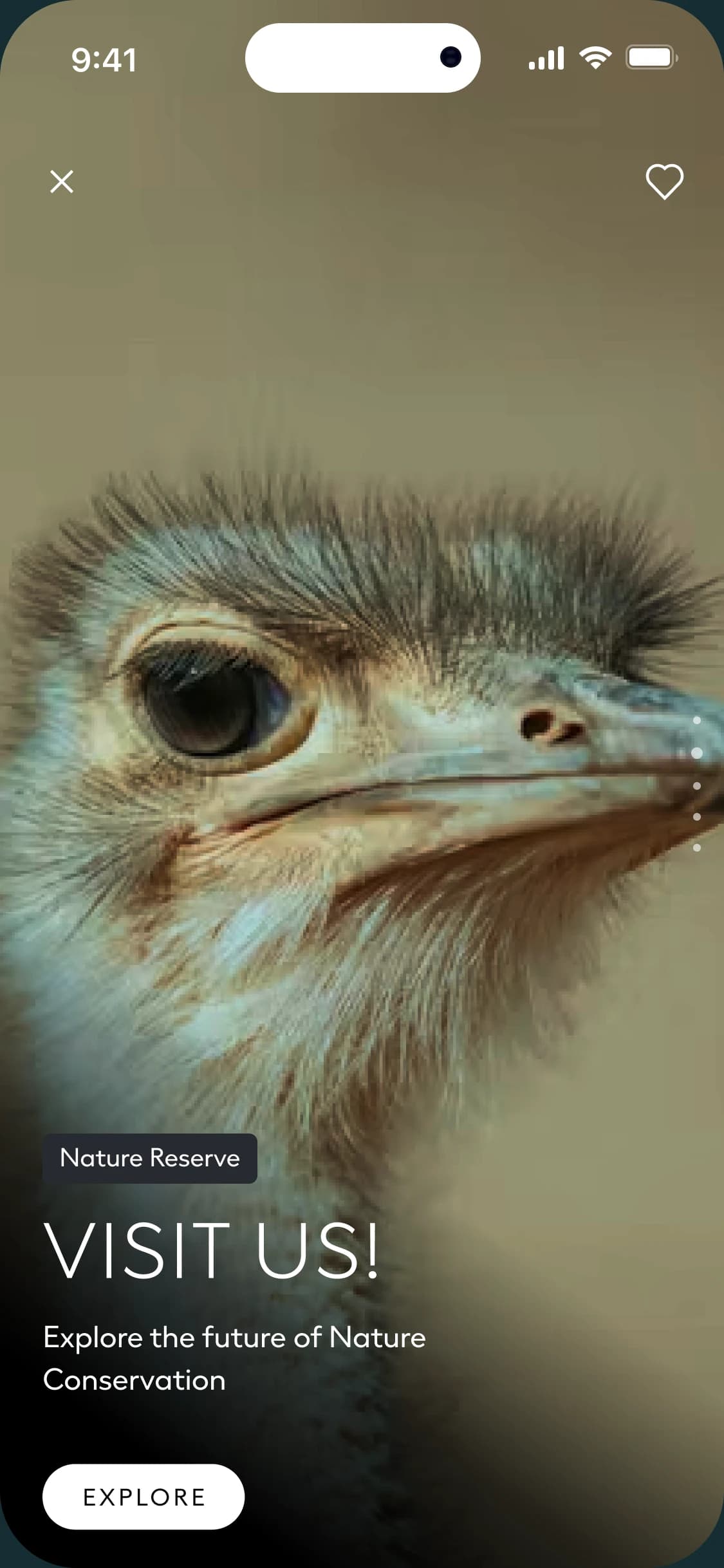
NEOM app screen filled by a close-up of an ostrich, with the place tag Nature Reserve, the title Visit us!, the line Explore the future of Nature Conservation and an Explore button
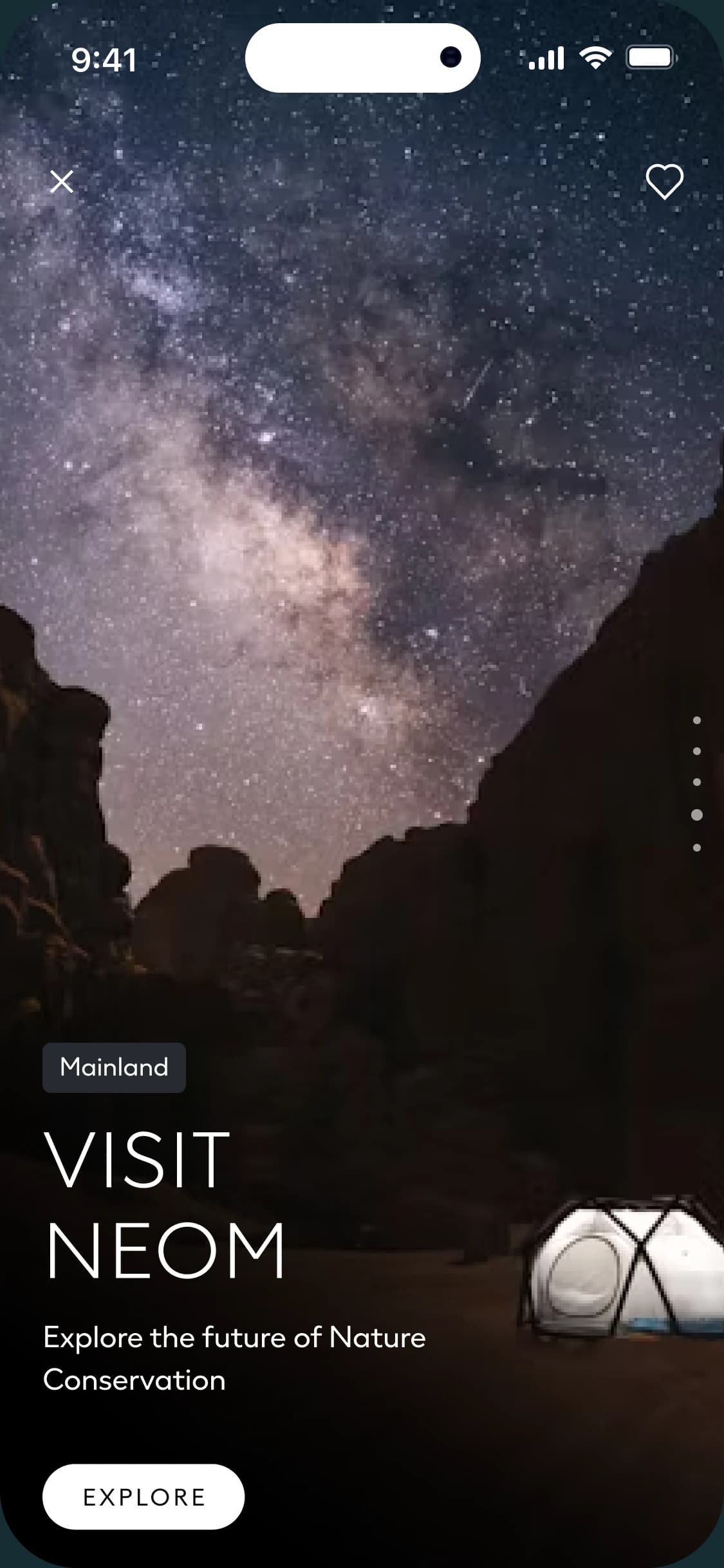
NEOM app screen showing the Milky Way above desert cliffs and a dome tent, tagged Mainland and titled Visit NEOM

A little context.

Nature needs a place in the journey. Within a wider app for discovering NEOM, wildlife and conservation content offered an invitation to look more closely at the natural world.

The design places nature reserve experiences and wildlife stories alongside regions, activities and trip planning. Each moment begins with an image, a clear invitation and a way to explore further.

Make the encounter feel immediate.

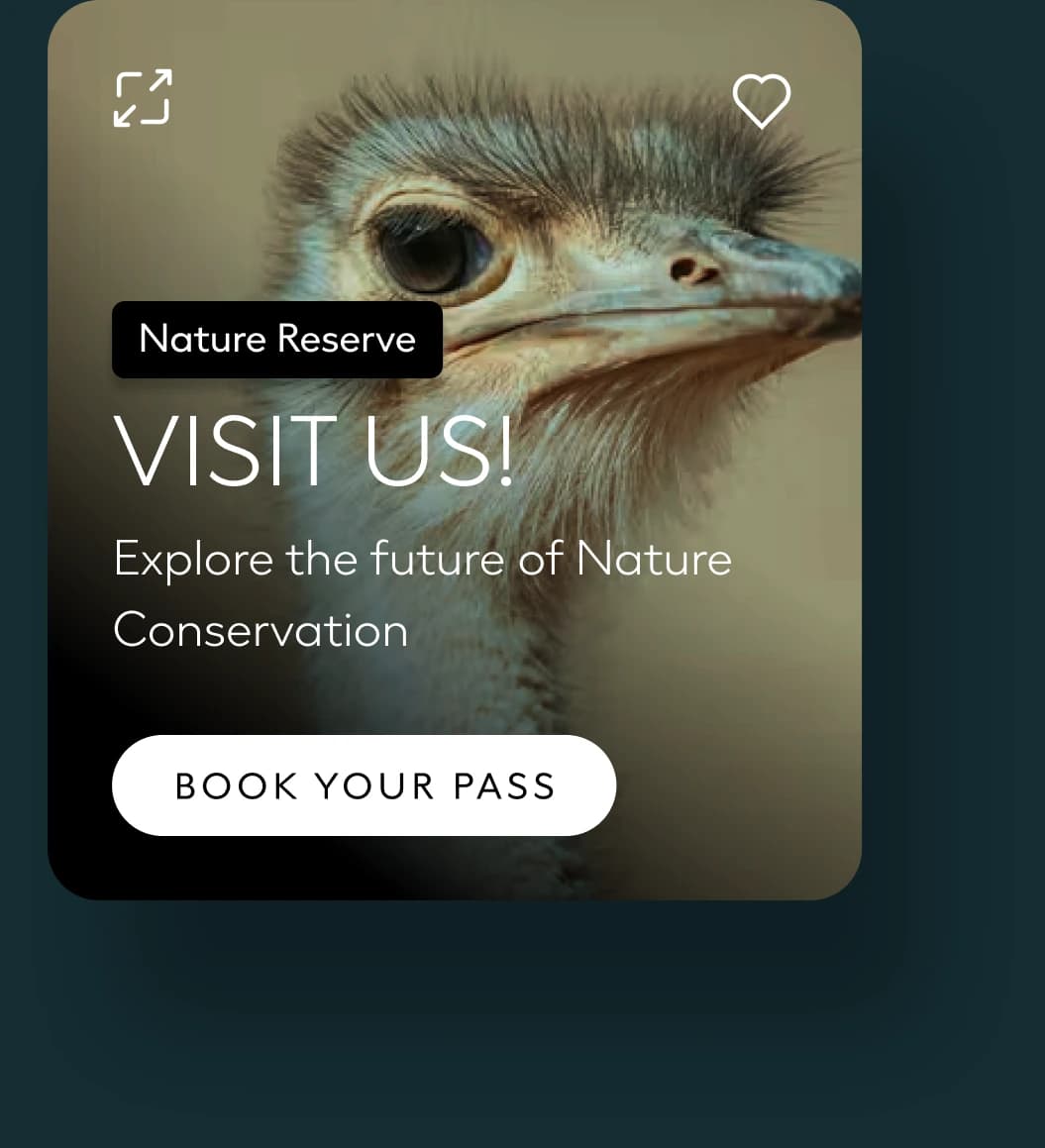
The Nature Reserve card starts with a close-up. Before any description, you are face to face with the animal, and a short invitation says where to go next.

Open the card and the same image fills the screen. The invitation keeps its place and the action stays within reach, so moving from a glance to a closer look feels like one step.

Card with a close-up of an ostrich, the place tag Nature Reserve, the title Visit us!, the line Explore the future of Nature Conservation and a Book your pass button
  • A place
  • A short invitation
  • One action
The invitation as a card.
NEOM app screen filled by a close-up of an ostrich, with the place tag Nature Reserve, the title Visit us!, the line Explore the future of Nature Conservation and an Explore button
The same invitation, opened full screen.

Give nature a place in the wider journey.

The home screen connects things to do, places and stories. Nature has a way in through each of them, so it never depends on a single destination page.

  1. Among the things to do.

    The reserve invitation belongs to the same stack of cards as hiking and diving. It is offered as something to do, with the same weight as any other experience.

  2. Among the places.

    Nature Region sits beside Sindalah, Trojena, Magna and Oxagon. It is a place to explore in its own right.

  3. Among the stories.

    At the end of the page, wildlife returns as one of the tales visitors share.

The NEOM app home screen from top to bottom: a welcome with the assistant, a stack of Things to do cards, five regions including Nature Region, vibes, travel services and a grid of visitor stories ending with Wildlife

Let the subject lead the visual language.

Animal photography gives these moments their character. Around it the interface stays quiet: a place, a short title, a line of supporting text and one action.

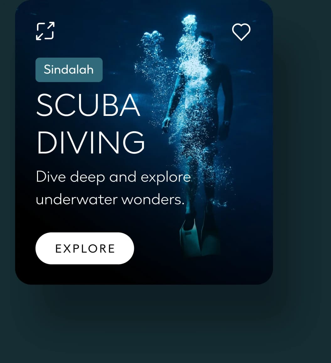
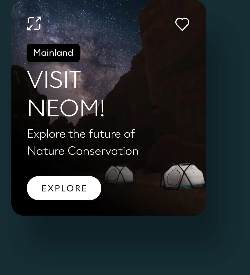
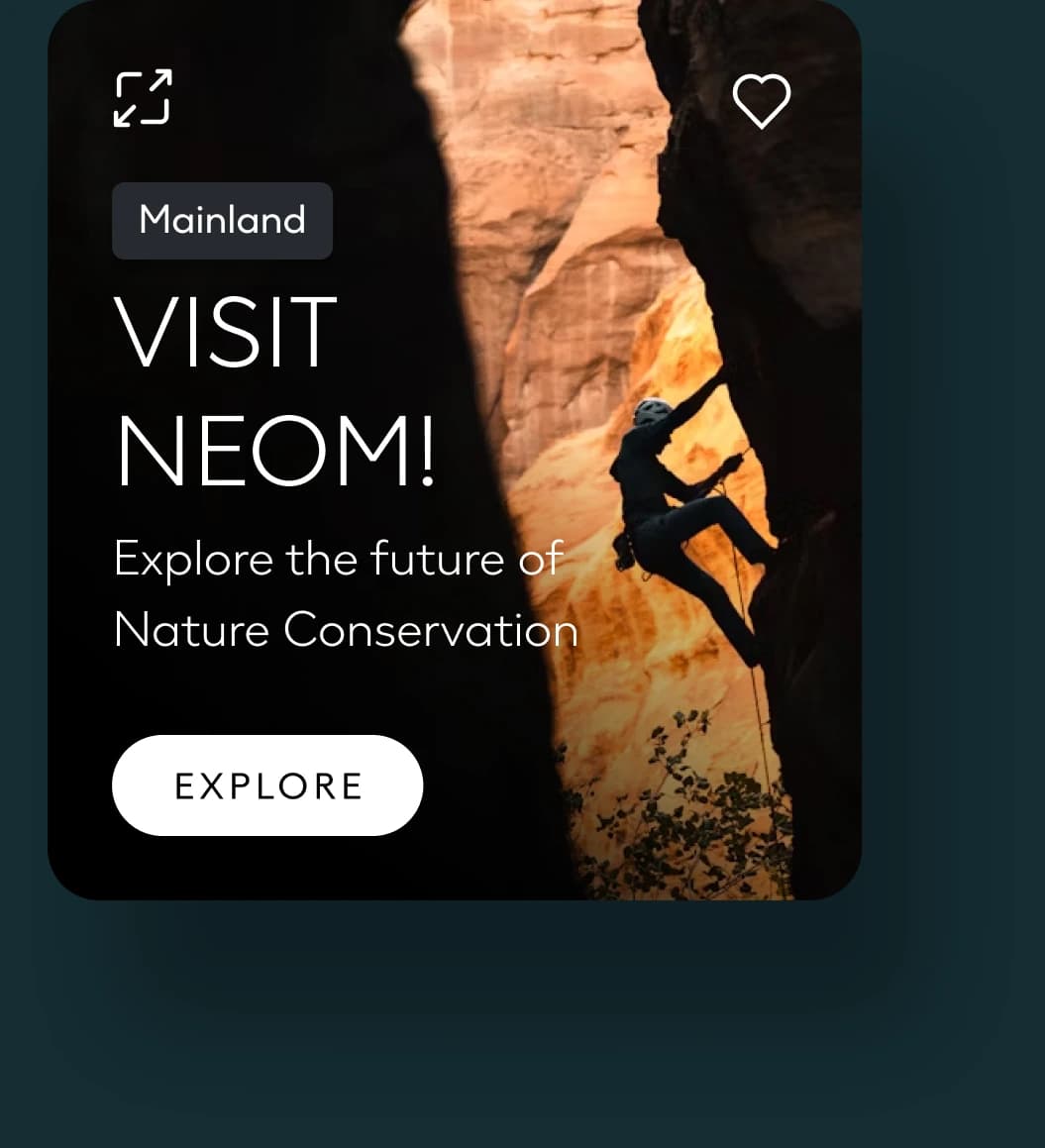
The same structure carries a dive, a night under the stars and a climb. Nature gets the same care and the same space as every other experience in the app.

Nature Reserve card with an ostrich close-up, titled Visit us!
Nature Reserve
Sindalah card with a diver rising through blue water, titled Scuba diving
Sindalah
Mainland card with dome tents under a starry sky, titled Visit NEOM!
Mainland, at night
Mainland card with a climber on a sunlit canyon wall, titled Visit NEOM!
Mainland, on the rock

What I take
from it.

The card, the opened view and the story entry share a simple idea: make nature visible, then make the next action clear. Each brings wildlife and conservation into the wider discovery experience while keeping the subject close.

The strongest part of this direction is its restraint. A close encounter with the image does much of the work; the interface gives that encounter a useful place in the journey.

Ahmed Mowgoud — UI, product & UX

Publicis Sapient — agency

NEOM — client

Nice things I’ve
done recently.

Let’s
have it.

let’s play together