Back to home

Lammetna

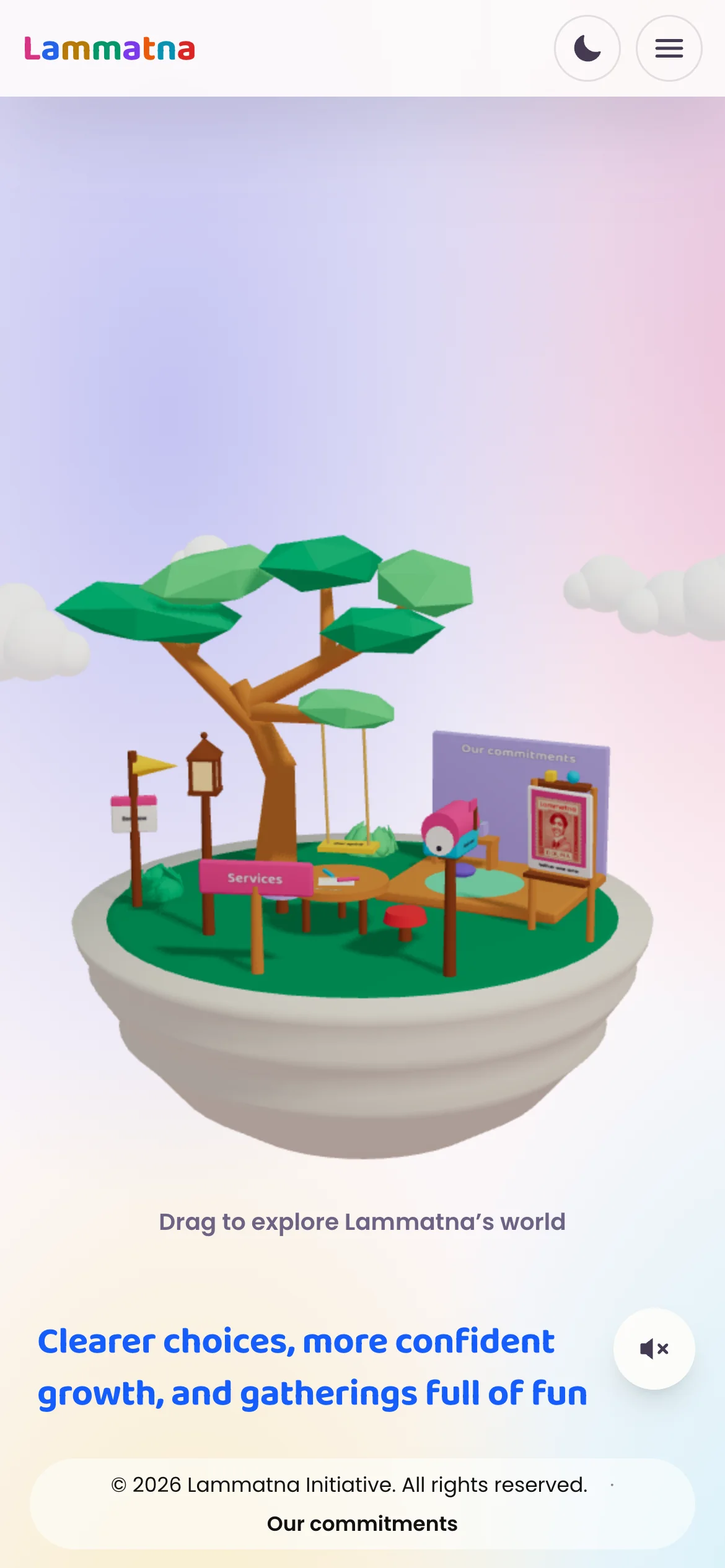
A little world for coming together. A bilingual platform that makes family support, discovery and social gatherings feel approachable.

Explore the experience
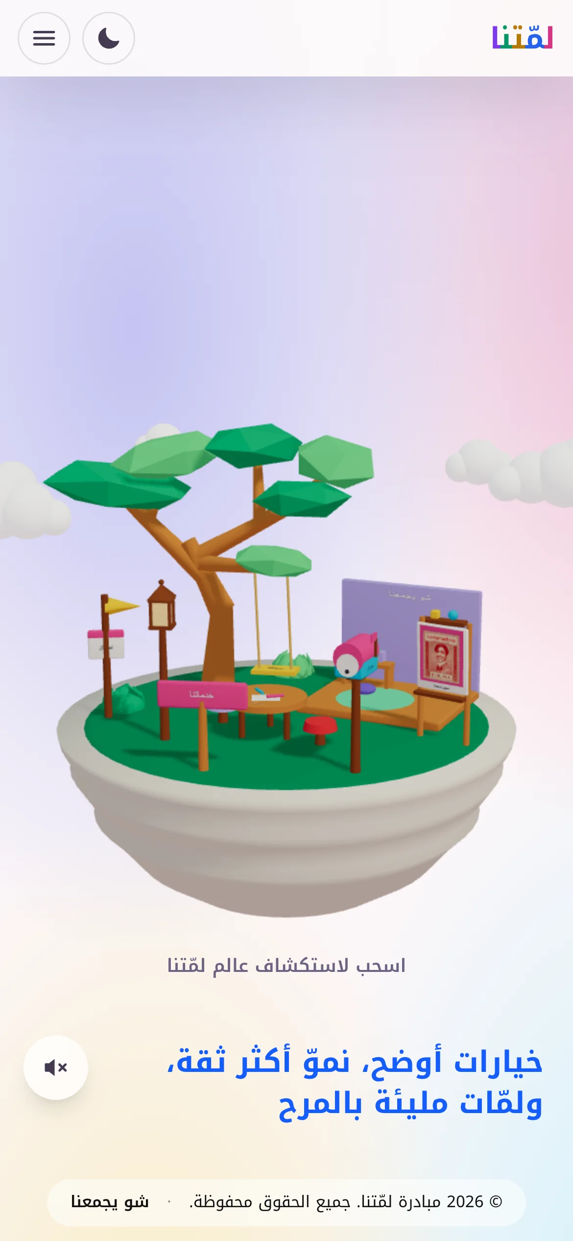
The island on a phone, with the introduction below it

A little context.

Lammetna brings families, children and teenagers together around information, shared interests and social activities. Its website has to explain that clearly and give the initiative a personality.

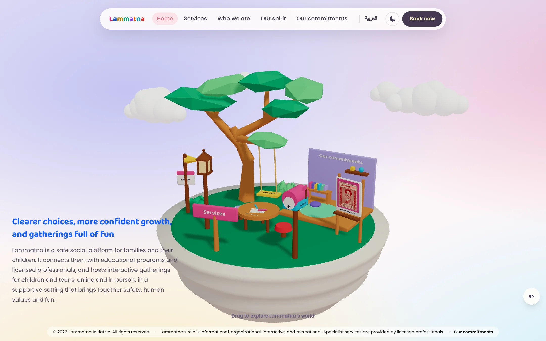
The opening turns the introduction into a small island: a broad tree, a swing, tables and colourful signs. A visitor can explore the scene or use the familiar navigation above it.
Make the welcome a place to explore.

The island gives an abstract idea a physical setting. Everything practical stays one step away from it.

  1. An island you can turn.

    Dragging moves the view around the tree. Signs on the island point to the same places as the menu.

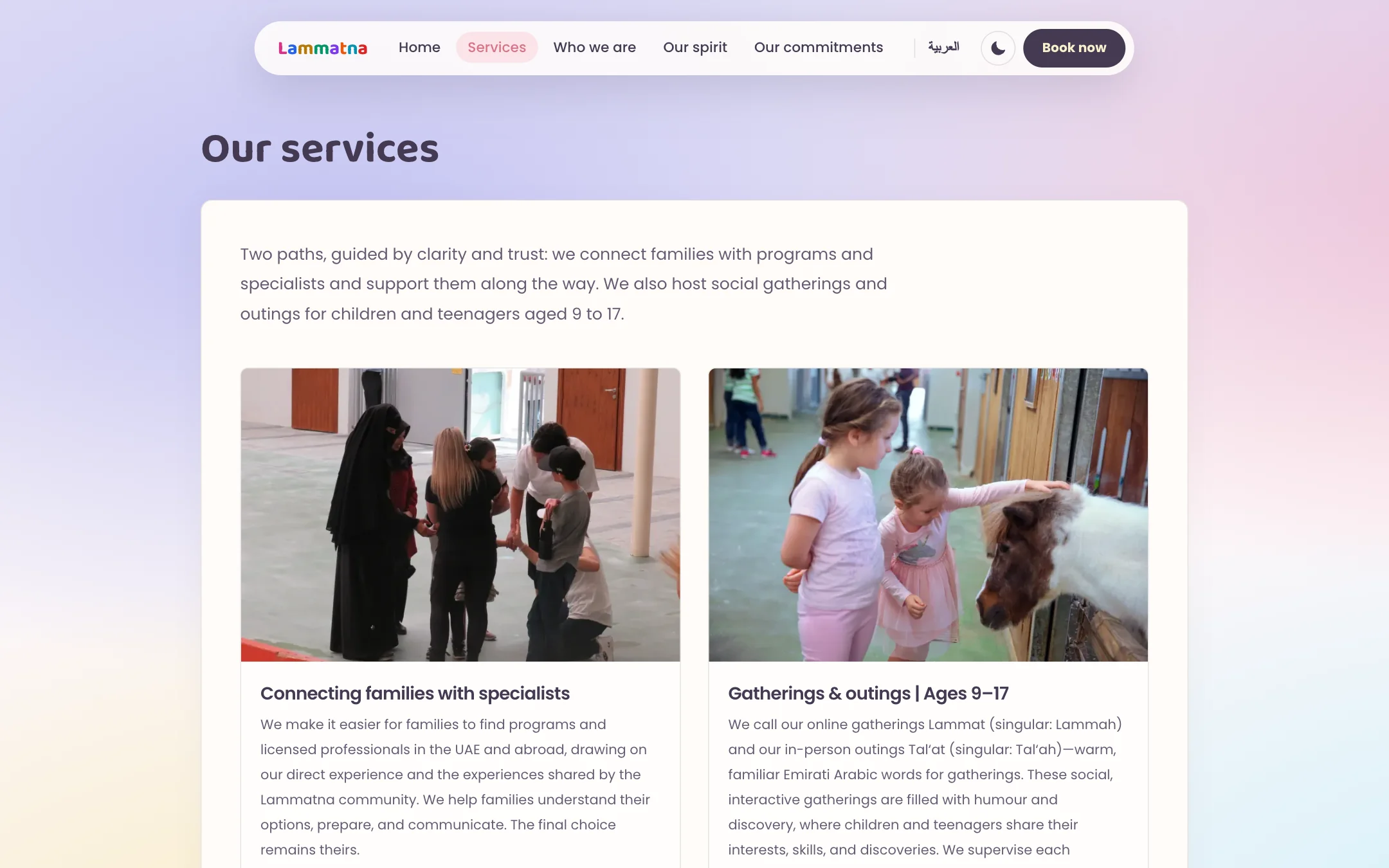
  2. Services, in two paths.

    Connecting families with programs and licensed professionals, and gatherings and outings for young people aged 9 to 17.

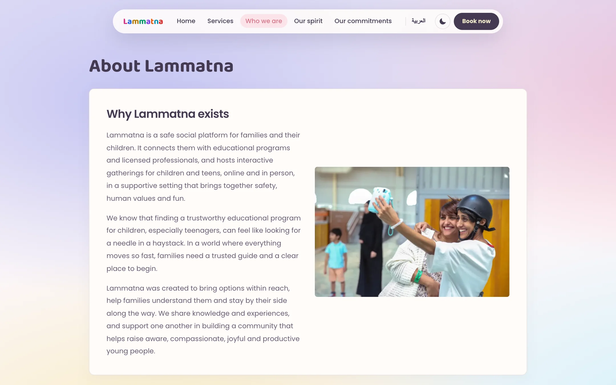
  3. Who is behind it.

    The reason the initiative exists, said plainly, beside a photograph from a gathering.

  4. What it costs, before you ask.

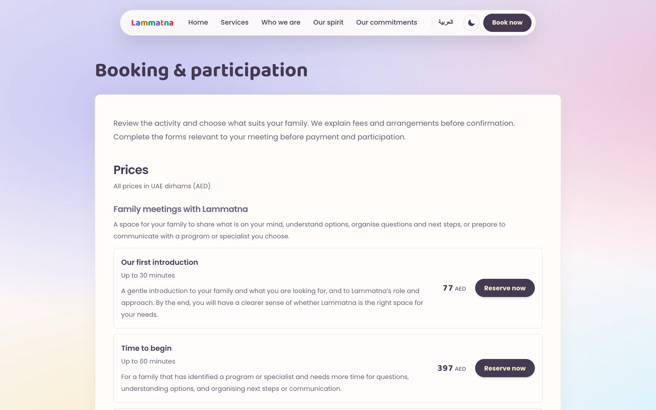
    Booking lists each meeting with its length and price, so a family knows what to expect before reserving.

  5. And after dark.

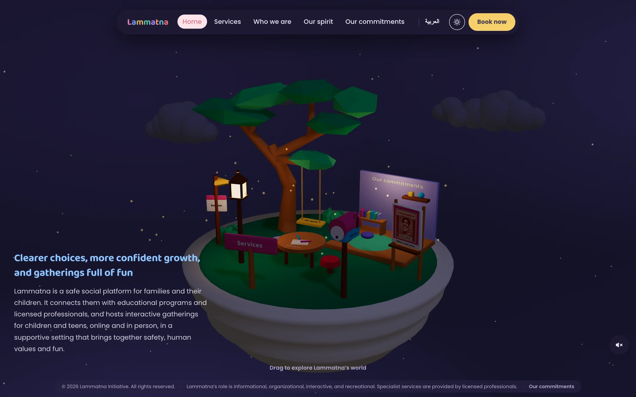
    Night mode keeps the island and changes the sky. The lantern on the island comes on.

Let both languages feel at home.

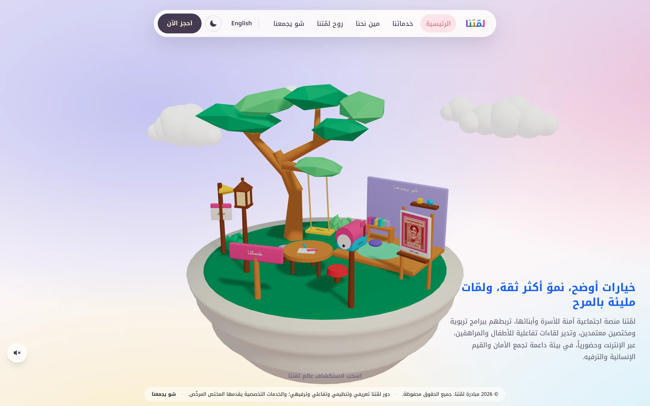
The English and Arabic versions share the same island. Navigation and copy change language and direction; the objects keep their place.

In Arabic the introduction leads from the right and the menu mirrors. The setting stays recognisable across both.

The island in Arabic: the menu mirrored and the introduction on the right
The island in Arabic, with the interface mirrored.
The island on a phone in English
English on a phone.
The island on a phone in Arabic
Arabic on a phone.
The island by day: a low-poly tree with a swing, tables, a lantern and signs, with soft clouds behind
The island by day.

What I take
from it.

The design balances a playful first impression with useful information. The island creates a memorable setting; the navigation and focused panels keep the next step understandable.

The value of this approach lies in the connection between personality and clarity. Both languages inhabit one coherent world, while the menus and panels give each next step a familiar shape.

Nice things I’ve
done recently.

Let’s
have it.

let’s play together